A family spends months planning a renovation. They research furniture online for weeks. They pick colours they love. They buy pieces they are genuinely excited about. And then the room is done, and something is wrong. Not obviously wrong. Not wrong in a way that is easy to point at. Just wrong in the way that makes people walk into the space and not quite want to stay.
The sofa is beautiful. The rug is exactly what they imagined. The paint colour looked perfect on the swatch. But the room does not work.
That gap between what people chose and what they actually got is where interior design lives. And every one of the mistakes that produces it is not a mistake of taste. It is a mistake of understanding. The homeowner did not lack opinions. They lacked a framework for translating those opinions into spatial decisions that produce the experience they were actually after.
This piece is about those mistakes. Not as a checklist of things to avoid, but as a map of what they reveal about how spaces actually work, and why understanding them properly is one of the most important things an interior design student can learn.
Why Homeowners Keep Making the Same Mistakes
Before going through the mistakes themselves, it is worth being honest about why they happen so consistently, across budgets, across cities, across decades of interior design content being freely available to anyone who wants it.
The reason is not ignorance. Most people who renovate a home have spent considerable time looking at images of well-designed spaces. They have Pinterest boards and saved Instagram posts. They know what good rooms look like in photographs.
The problem is that a photograph of a room is not the experience of a room. A photograph captures light at one moment, from one angle, in two dimensions. It tells you nothing about how the space functions when four people are in it. It tells you nothing about how the furniture feels to move through. It tells you nothing about whether the natural light in that particular room, at that particular time of day, makes the colour on the wall look anything like the colour in the image.
People learn to recognise good-looking rooms from photographs. They do not learn to create good-feeling rooms from living in them.
The Mistakes, in the Order They Actually Matter
1. Getting the Scale of Furniture Wrong
This is the single most common and most consequential mistake homeowners make, and it comes in two directions. The first is buying furniture that is too small for the room. The second is buying furniture that is too large. Both stem from the same underlying error: judging scale from a showroom floor or a product photograph rather than from the actual spatial relationships that will exist in the finished room.
A sofa that looked generous in a furniture showroom can disappear into a large living room and leave the occupants feeling exposed and unanchored. A dining table that seemed the right size online can, once delivered, make a room feel like there is barely space to pull out the chairs.
The Fix: Scale is not the size of individual objects. It is the proportional conversation between all the elements in a room furniture, architecture, light, and the human body. Getting there requires proper space planning before buying anything.
2. Choosing Rugs That Are Too Small
A rug that is too small for a seating arrangement does something very specific and very damaging to a room: it breaks the space into disconnected fragments. The furniture floats above it, and the rug looks like an afterthought placed in the middle of the room rather than the spatial anchor it is supposed to be.
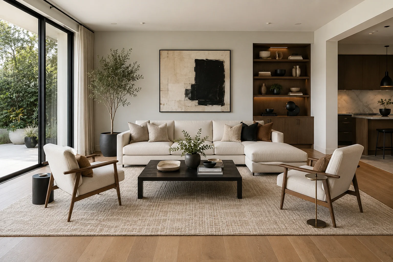
The Fix: A rug in a seating arrangement should have at least the front legs of all major seating pieces on it. Ideally, all four legs of every piece are on the rug. This creates a unified spatial zone a room within a room that makes the arrangement feel deliberately composed.
3. Hanging Artwork and Mirrors Too High
Walk into almost any home that has not been professionally designed and look at where the artwork is hung. In the large majority of cases, it will be significantly too high. High enough that the centre of the piece is at or above eye level when standing. This means when you are sitting where you spend most of your time in a living room the artwork is above your comfortable field of vision entirely.
Artwork that floats above the furniture level is not in the same visual world as the people occupying the room. It does not anchor the space.
The Fix: Follow the standard gallery guideline centre the artwork at approximately 145 to 150 centimetres from the floor. This reflects roughly seated eye level for most adults. Artwork should be in visual conversation with the people who inhabit the space, not displayed above them.
4. Using Only One Source of Light
The overhead ceiling light is the enemy of atmosphere in residential spaces. The single overhead source casts flat, directionless light that flattens surfaces, eliminates shadow, and produces a quality of illumination associated with hospitals and offices.
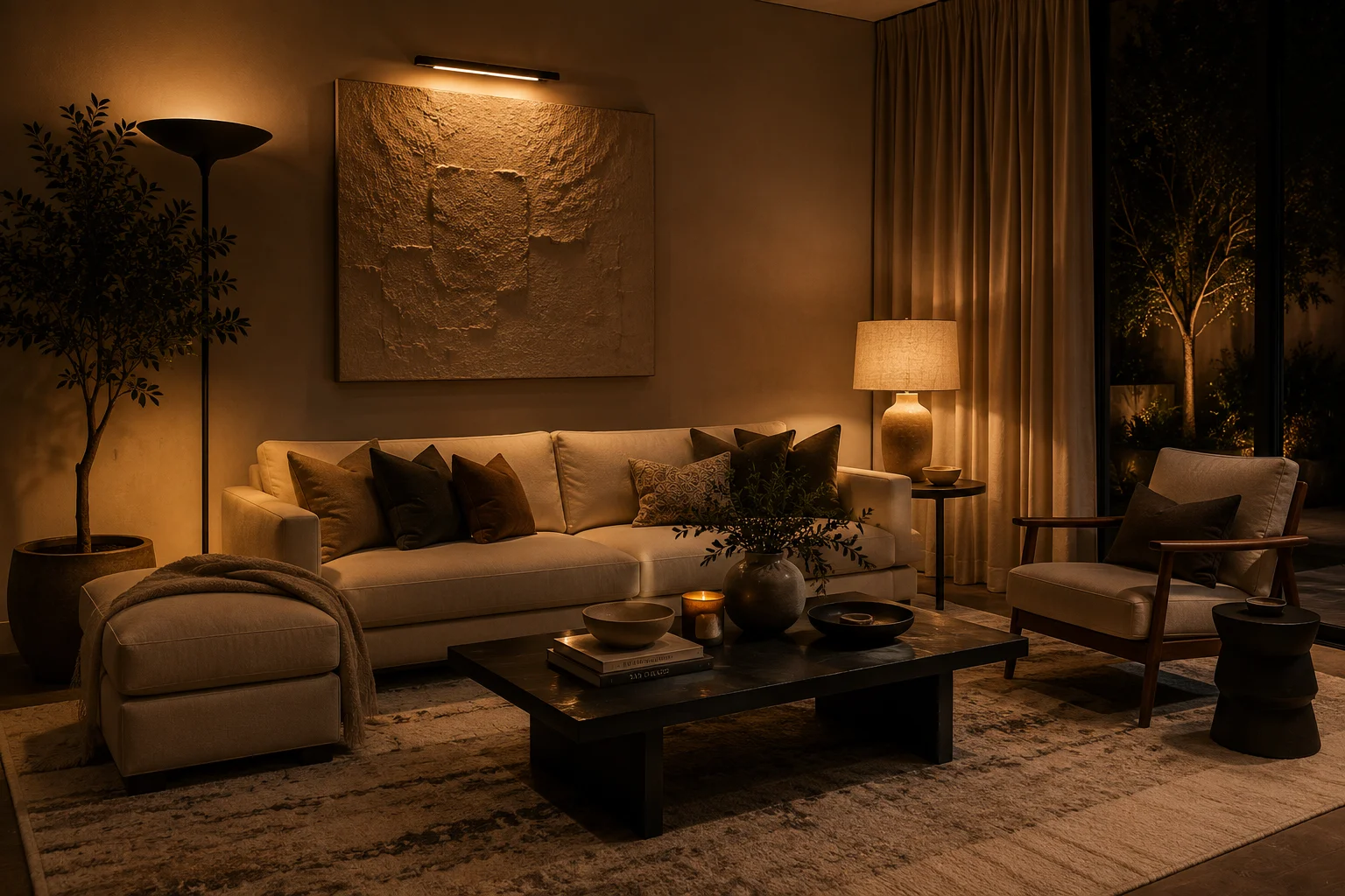
The Fix: Rooms that feel genuinely warm are lit from multiple sources at multiple heights (often referred to in architectural lighting standards as "layering"). Floor lamps cast light upward. Table lamps create pools of warm light at eye level. Accent lighting highlights a textured wall. Light at eye level creates spatial intimacy that makes people want to be in a room rather than pass through it.
5. Ignoring the Entrance
The entrance of a home sets the psychological register for everything that follows. Walk into a neglected entrance an overcrowded coat rack, nowhere to put keys, no considered relationship between the front door and what lies beyond it and the sense of disorder follows you in.
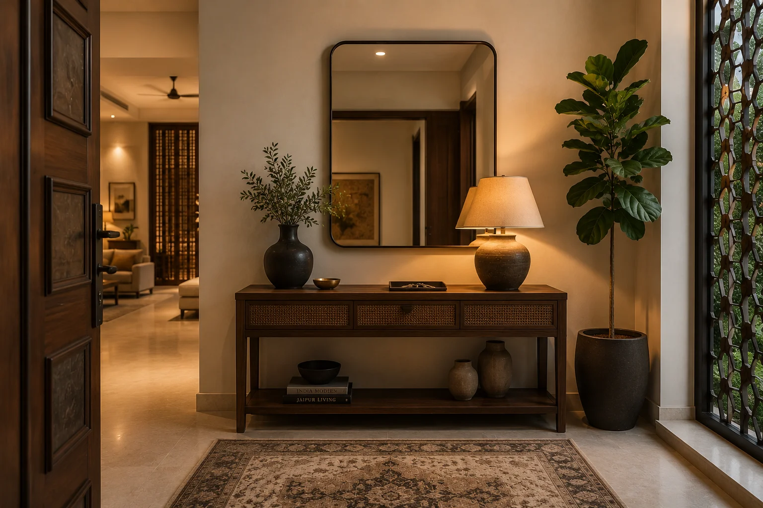
The Fix: The experience of a home begins at the threshold. The relationship between outside and inside, the psychological shift from public to private, all happens here. Treat the entrance as one of the highest-leverage spaces in a home.
6. Over-Matching Everything
The matchy-matchy interior the sofa set bought as a complete ensemble, the bedroom furniture that comes from a single collection is one of the most reliably unsuccessful approaches to residential design. It feels safe, removing the risk of clashing, but it also removes all the visual interest that makes a space feel lived-in.
The Fix: Rooms that feel genuinely well-designed rely on visual tension. An aged timber floor paired with a crisp contemporary sofa. A traditional textile alongside a clean-lined modern chair. These combinations work because the designer understood what they had in common (a colour relationship, a material contrast) and used that to create depth.
What These Mistakes Look Like in the Gujarat Context
These mistakes are universal, but they take specific forms in the Gujarat residential market:
- The Scale Problem: Acute in the apartment buildings being constructed across Ahmedabad, Surat, and Vadodara. Smaller floor plates mean the margin for scale errors is narrower. A sofa that is two sizes too large in a compact apartment makes the space genuinely unusable.
- The Lighting Constraint: Builder-grade apartments almost universally come with a single overhead light point. Homeowners who accept this live in spaces that are perpetually flat and overlit. Designers who understand how to plan a layered lighting scheme within existing electrical infrastructure are solving a massive local problem.
- The Cultural Threshold: The entrance neglect problem is particularly pronounced because of the cultural significance of the threshold in Indian domestic tradition. A well-designed entrance that acknowledges this transition from the outside world carries real cultural and psychological weight.
Turning Intuition into a Career: The Mindset That Serves You
What do all these mistakes have in common? They are the result of making decisions about individual elements in isolation rather than making decisions about spatial relationships.
Interior design is fundamentally about relationships: spatial relationships, material relationships, acoustic relationships (how soft furnishings change the sensory feel of a room), and the relationship between a space and the people who inhabit it.
Understanding these mistakes is not the same as being able to prevent them. That requires a framework for spatial thinking that allows you to see potential problems in a 2D space plan before they become expensive realities. The technical training that builds that framework space planning, material specification, lighting design, scale, and proportion is what serious interior design education provides.
How Amor Design Institute Prepares You for This
For those looking to transition from simply recognizing good design to actually engineering it, ADI’s interior design programme is built around the understanding that technical skill without spatial intelligence produces designers who can follow a brief, but cannot lead one.
The curriculum covers space planning, material science, lighting theory, and project management in an integrated way that mirrors how real projects work. You learn to think about a space as a total experience before you think about any of its individual components.
- Real-World Application: Faculty with real industry experience close the gap between classroom instruction and professional practice.
- Industry Integration: With 25 years of placement connections across Gujarat's design and construction industry, the annual Amor Rasa showcase, and IMB Milan international certification, graduates leave with the portfolio and network needed to turn education into a career.
The homeowners who make the mistakes listed above are not your adversaries they are your future clients. The reason they need you is precisely because the knowledge that prevents these mistakes is not intuitive. It is learned.
Ready to build that framework? Admissions for 2026 are open at www.amordesign.org. Call +91 90236 55176 to find out more.